Finding statistics on San Francisco’s public transportation
This week saw the end of a major group project I was on. This can be considered the capstone project of Lambda School, where I have been studying data science, and it also involves all of their courses. I was assigned to a team with 3 other data scientists, 5 web developers, and 1 UX designer. The 10 of us had 8 weeks to build a real product, according to a stakeholder’s vision.
The problem
Our team was assigned to the SFMTA Data Analysis project, which aimed to build a dashboard that showed detailed statistics about public transportation in San Francisco. Our stakeholder, Jarie, intends to use this to help city advisory councils make well-informed decisions to improve transit.
Lambda Labs isn’t about building the whole product in just 8 weeks. Usually a few labs groups will need to work on a product before it is finished, and we were actually the second team to work on this. The team before us had managed to build a website that could show all the different routes on a map. While that was a good base, it didn’t have any of the statistical analysis that Jarie was looking for. So our main goal was going to be getting the data and statistics working.
The main problem with all of this was the lack of historical data. Many times those councils tried to ask questions such as “why is X route always late?”, the SFMTA (San Francisco Municipal Transportation Agency) could not give a clear answer. On the public side of things, live transit data was being provided through the Nextbus API, but only live data was available.
Our plan
Our solution to all of this was fairly obvious: start storing that live data, and build a dashboard that displays statistics based on that data.
Labs highly encouraged using Amazon AWS to deploy our projects, so that’s exactly what we did. We started researching the different tools AWS offers, while also planning out the statistical analysis we would be doing.
Additionally, whatever we built would need to be able to scale automatically. This project came right in the middle of the COVID shutdowns, and we estimated that the current service was somewhere between a third and a half of what would normally be running.
The data science team decided to deploy a set of scripts on AWS Lambda, since it was a cheap and easy way to set up recurring functions. And all data would be stored on a PostgreSQL database on AWS RDS. While I am admittedly less familiar with the web team’s deployments, they made use of AWS Elastic Beanstalk and Amplify to run the website itself.
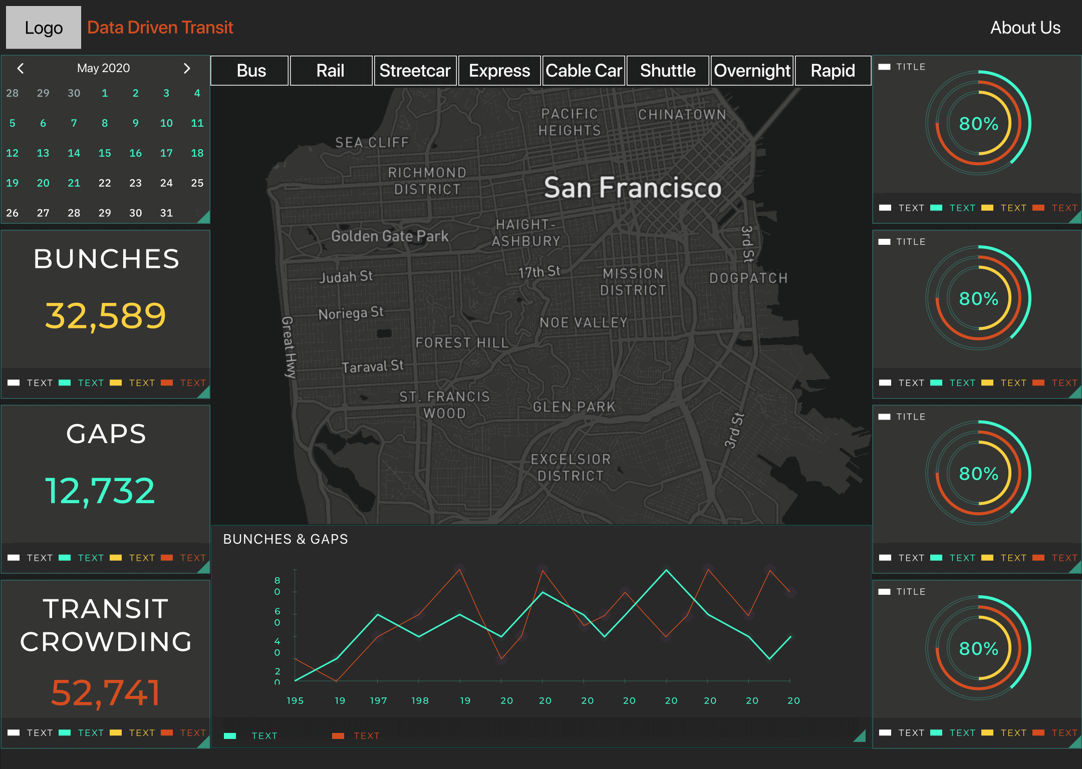
And of course our UX designer started coming up with the layout for the dashboard. Here is one of the earliest design mockups:
Collecting the data
There was quite a lot of information coming in, just not always in the most helpful way. The bus location data wasn’t a high enough precision to tell us exactly when buses were at their stops, and the route and schedule definitions weren’t in a very easy to use format.
The live location data included the latitude and longitude of every active bus in the system, as well as their speed, heading, and a direction marker for if it was on an inbound or outbound trip. Buses would upload data to this api every 60 seconds or so, and there was an additional field that showed the number of seconds between when the bus reported its location and when you accessed it through the api. Knowing that, we set up a script that would save those location reports every minute. This would make up the bulk of our data, since it meant adding a row to our database every minute for every active bus. After about 1 month of this, the database had around 8 million rows.
The other thing we would need to save for our historical analysis was the schedule and route definitions. The schedule was simply the times that each route was scheduled to stop at different bus stops, and the route definition included a list of stops on the route, the locations of those stops, and a list of lat/lon coordinate paths that described the route itself. Recording this was far simpler since these would not change very often. We settled on checking once per day to see if either part had changed. We saved each unique entry with a start and end date to show when that definition was active.
All of these collection scripts run on AWS Lambda. We actually found this to be an extremely reliable service, since if a script throws an error it will automatically try to run it again up to two more times. And it will attempt to run the next scheduled time even if all three of those attempts fail. This was important since we found an issue where the bus location API endpoint would sometimes (rarely) return an empty JSON object instead of the requested data. Trying again often solved that.
Statistical analysis
Now that we had all that data, we could start to analyze it and come up with the statistics this project aimed to show on the dashboard. We decided on five numbers that would be displayed:
- Bunches
- A bunch happens when two buses get too close together. Formally, it is defined as when there was only 20% of the expected headway, or time between buses.
- For example, if a bus route was scheduled to visit a stop every 10 minutes, then two buses arriving at that stop within 2 minutes of each other would be a bunch.
- We measured this by getting a list of times each stop saw a bus, then comparing the time intervals to the expected headway for that route.
- Gaps
- Very similar to bunches, gaps are when buses get too far apart.
- Gaps are formally defined as 150% of expected headway, and were measured the same way as bunches.
- On-time Percentage
- This is simply the amount of times buses were at their stops when the schedule said they would be.
- We used the same definition as SFMTA: a bus is considered on time if it is at the stop between 1 minute early and 4 minutes late.
- Only some of the stops on each route actually had scheduled times (usually around 20%), so this was only measured at those scheduled stops instead of at all stops like bunches and gaps were.
- Coverage
- This statistic is a combination of bunches and on-time. A route is considered “covered” is it is either on time, or has bunches (more than on time).
- This statistic made a bit more sense earlier in our development, when we were going to try and measure bunches and gaps by actually tracking the time between buses themselves instead of just measuring when they were at each stop. More on that later.
- Overall Health
- We wanted to have one main statistic we could compare between routes, so for this we used an average of the other statistics.
- We combined bunches, gaps, and on-time percentage. Coverage was left out because it was already dependent on the others.
Calculating all of this was fairly expensive computationally, since we were working with so much time-stamped gps data at once. We knew from the start that it would likely be slow, so we planned to pre-calculate all of the statistics and save them as a “daily report” that the dashboard could display on demand.
In practice, our first version of the code was not well optimized and took 20 minutes to generate the report for all routes on a single day. We spent some time optimizing it though and got it down to just 3-4 minutes for that single day. The scripts ran a little slower on AWS Lambda than on our own machines, so it ended up closer to 6 minutes there. This definitely justified our design decision to generate the reports ahead of time.
The result
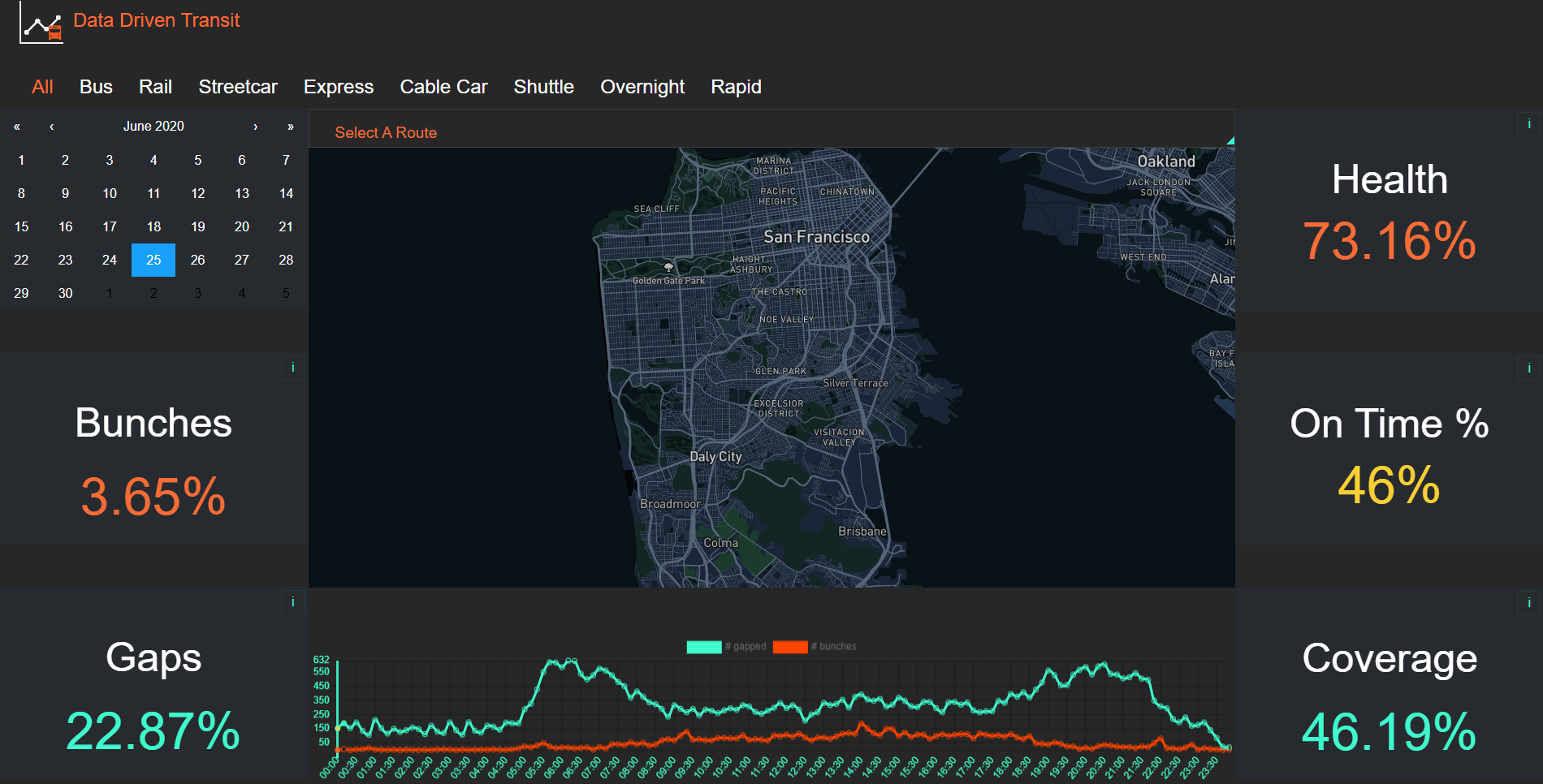
As you can see, we were able to create a dashboard that displays the five statistics we calculated, as well as a line graph that shows the number of bunches and gaps throughout the day. We were happy with what we accomplished, but of course there is more than can be done.
The image above is a screenshot of how the site looked when my team finished our work. The live site is available at https://www.datadriventransit.org/, I cannot say when the next team will start making their changes. I myself am interested to see where this project goes in the future.
(Update Sept. 1 2020: The website itself is no longer working. Since I am no longer on the project I don’t know the exact status, but it was always planned that future teams would continue working on it. I am leaving the original link here in case it comes back online.)
I also have a version of the report generation code available to view here on Google Colab, so you can see how we calculated things before future teams do their work. The code did get a couple minor optimizations and tweaks after we moved it from Colab to to deployed .py files, but it is functionally the same.
What’s next
Of course there are things I might have done different if we had the time, and there’s plenty more we didn’t even start on.
The most obvious one is the map. We had wanted to show bunches and gaps on the map so we could see where they were happening geographically, instead of just chronologically with the line chart. While some of that data exists in the daily reports already, we did not have enough time to start displaying it on the website.
Another is the coverage statistic. I already mentioned it made more sense earlier in our development. As it is now, I feel like it doesn’t add much to the other four statistics. We were running out of time and were not quite sure what to replace it with, so it was left on the dashboard for now.
The code could also use more optimization. While we were able to reduce the report runtime by a lot, it’ll still be approaching AWS Lambda’s hard 15 minute limit once all routes are running again. And it would be a very nice feature to be able to generate custom reports on the fly, though that particular feature might be more difficult to pull off.
What I learned
Overall, this was a great experience. We got to work on a real project with people from other disciplines for an extended period of time. It’s the closest we’ll get to actual job experience until we actually get jobs.
The team itself was great, but we still learned about communication. Trying to coordinate between data scientists, web developers, and a designer, all while maintaining a cohesive product vision, was something we all had to get used to.
Getting to work with AWS was also very cool. I know we barely scratched the surface of what it can do, but even learning that much is valuable since I now have a starting point for any other work I might do with it in the future.
Lastly, I’m glad I got to do some real data engineering. Up till now, the Lambda School course has focused on statistics, machine learning, and data storytelling. Setting up our own pipeline to gather, store, and analyze data was a challenge that I am happy to say we pulled off.
This wasn’t a perfect project by any means, but I am still proud of what we did and I’m glad I had the opportunity to work on this.